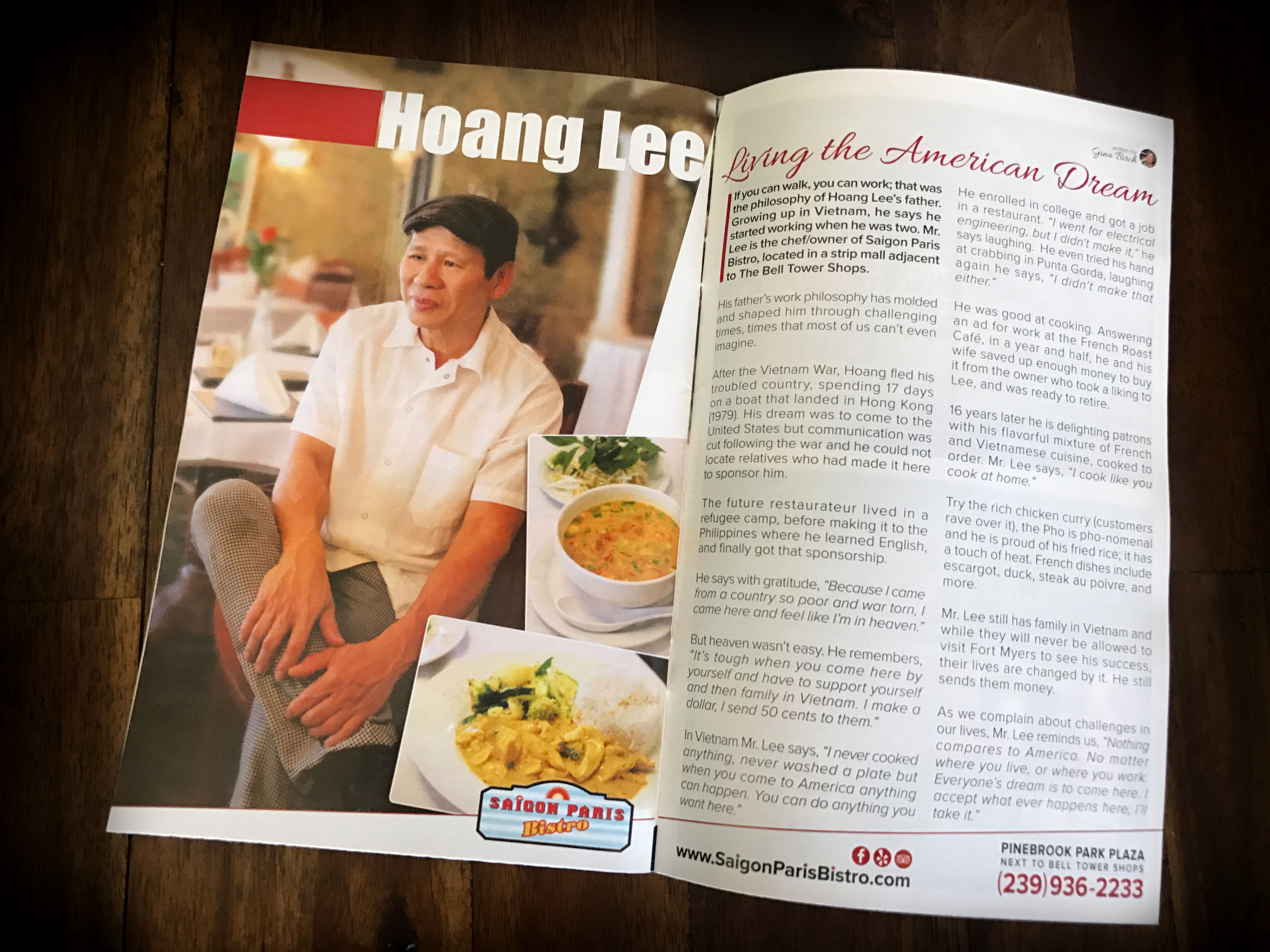
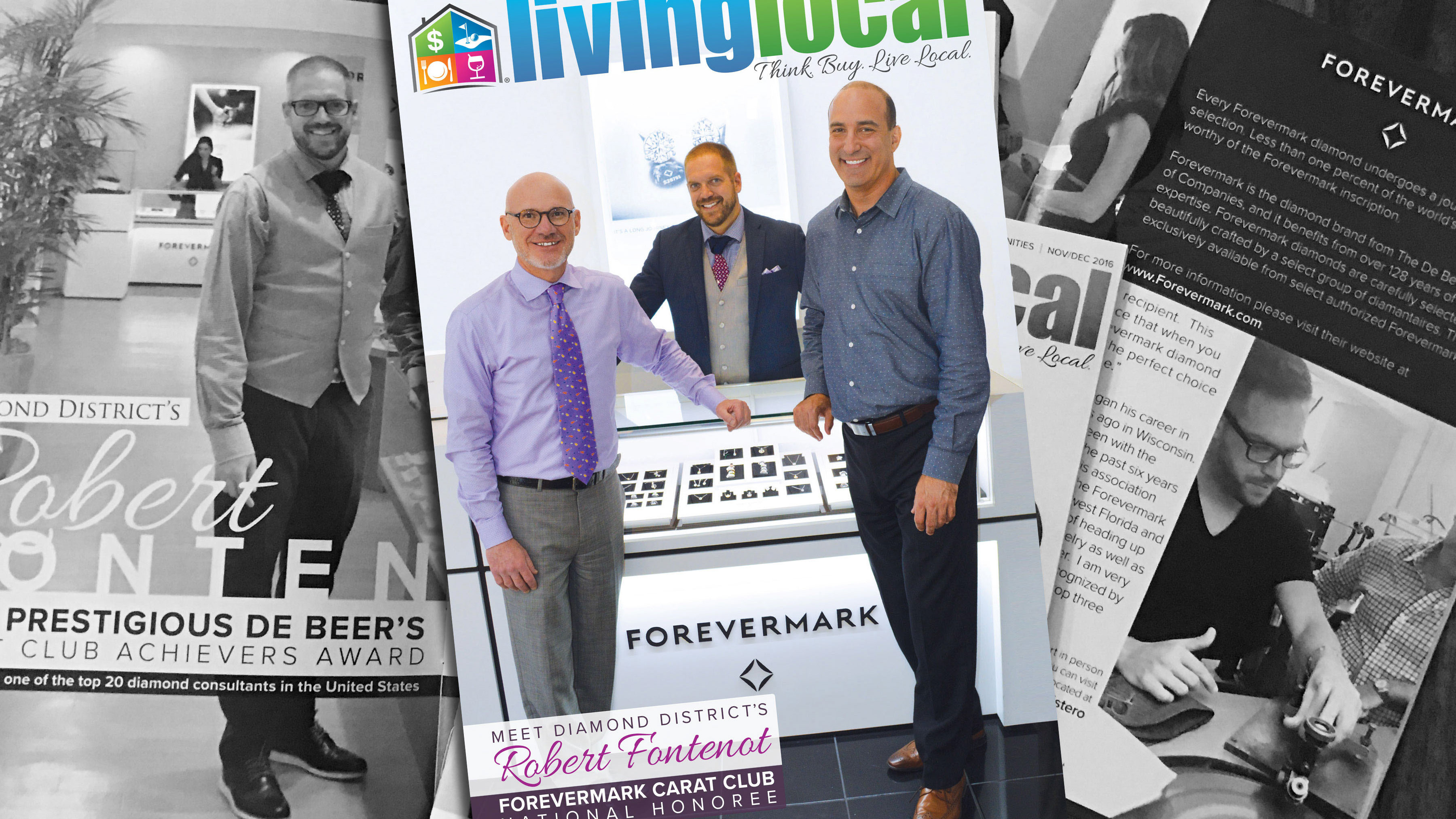
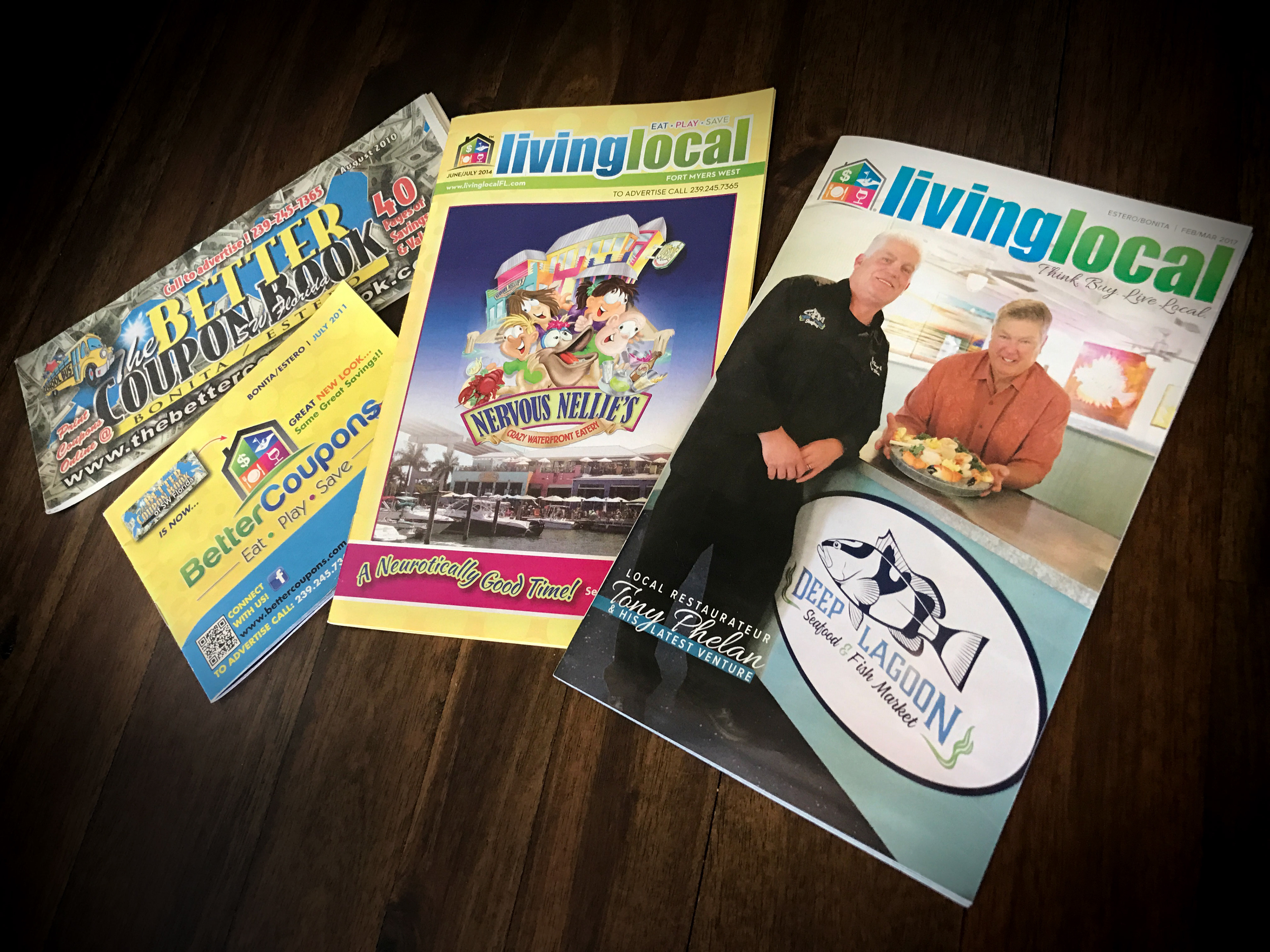
This image shows the evolution of the brand from before I worked at the magazine up until my redesign. In 2010 the publication was a newsprint coupon book. In 2011 the name changed to Better Coupons and the house logo was introduced. By 2014 the publication adopted the name "Living Local" as more local interest content was being introduced. In 2016 I was brought on as the Publication Director charged with refreshing the brand and the overall design of the book. I modernized the logo, the brand & the book; I added a table of contents, an events page, and laid out all feature content as magazine spreads rather than advertorials.
Living Local Rebranding
Among my first projects when I was taken on as the Publication Director and Graphic Designer at Living Local Magazine in mid 2016 was to refresh the logo and branding of the company. The publication was already in the process of changing from a coupon book to a magazine and had changed its name from Better Coupons to Living Local. I was tasked with refreshing the branding to match the evolution of the book. I removed the stroke from the logo and thinned out the border around the house icon. I changed all the colors form 4 color inks to 3 color inks to enhance the logo's overall vibrance in print. The result was a much more modern and impactful feel to the brand and the magazine.